
Brutalism graphic design is a striking visual style. It often features bold, raw, and honest looks. It breaks away from polished and overly refined designs, opting for a more rugged and unfiltered look. This style can grab attention effectively and also convey authenticity.
Brutalism is a movement in mid-twentieth-century architecture. It is known for its stark use of raw concrete and bold shapes. This architectural philosophy found its way into graphic design, challenging traditional aesthetics. Brutalism in graphic design values boldness, honesty, and rawness. It uses things like oversized text and unpolished images. This approach can be impactful. However, it is ultimately limited in scope. Its strength is greatest in specific niches.
The Strength of Brutalist Design
In recent years, brutalism graphic design has seen a renewal, particularly in the digital world. Websites and online platforms are adopting this design approach. They do it to stand out in a crowded digital space. The simple elements and unconventional layouts challenge web design standard. They are not traditional. They make the designs memorable and unique.
Brutalism in graphic design is not just about aesthetics. It’s a powerful tool. It can create strong experiences and evoke deep emotions. Let’s delve deeper into its strengths:
Visual Impact
Brutalist elements are designed to grab attention.
-
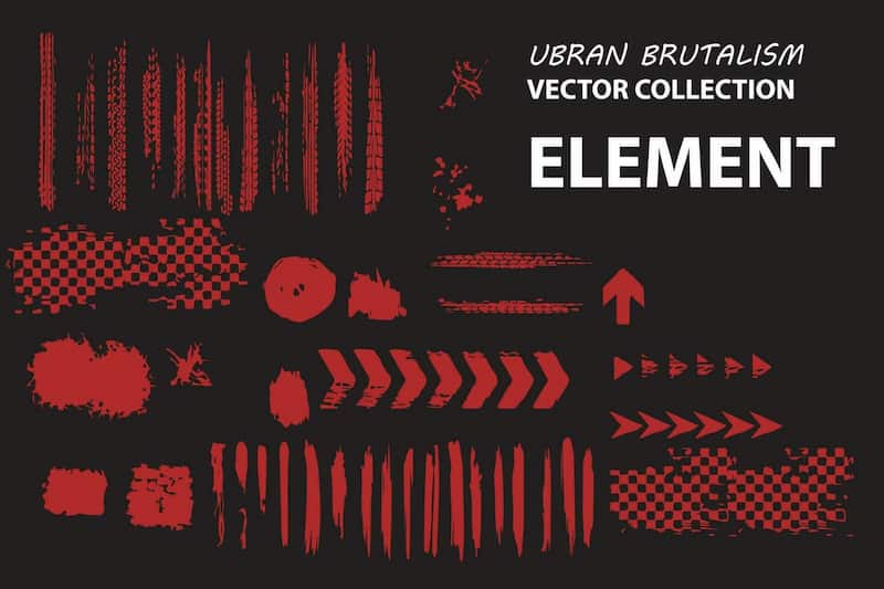
Bold Typography: Forget dainty fonts. Brutalist design employs oversized, often sans-serif typefaces that dominate the composition. Imagine a giant, chunky headline screaming a message that is impossible to ignore.
-
Stark Contrasts: Brutalist palettes typically feature limited, high-contrast colors. Think black and white, or a single bold hue against a stark background. This creates a sense of drama and focus that draws the viewer in.
-
Unconventional Layouts: Brutalist design throws traditional grid systems out the window. Expect layouts that are not symmetrical. They will have overlapping elements and empty space used as a design element. This visual disruption keeps the viewer engaged and encourages them to explore the composition.
Brutalist design may seem niche. However, its core ideas are surprisingly adaptable.
-
Posters: Brutalist elements shine through on posters. A bold headline, a powerful image, and contrasting colors create a message that sticks. Think of concert posters or political campaign materials that utilize this style for maximum impact.
-
Editorial Design: Brutalist layouts can revitalize magazine or website design. Imagine a magazine spread with a large photo next to stark headlines and minimal text. It’s a refreshing change from traditional layouts.
-
Branding: Certain brands can benefit from a Brutalist approach. For example, a streetwear brand can use Brutalist design’s raw energy and authenticity. It can utilize them to build a strong image.
Emotional Response
Brutalism doesn’t shy away from strong emotions.
-
Power: The starkness and scale of Brutalist elements project a sense of power and authority. Think of government posters or protest materials. They use this style to convey a strong message.
-
Rawness: The use of unpolished textures and unconventional layouts evokes a sense of rawness and honesty. This can work well for brands. They want to seem real and humble.
-
Grit and Determination: The industrial feel of Brutalist design can convey a sense of grit and determination. Imagine a poster for a marathon or an endurance race. The brutalist look can capture the raw challenge and drive of the event.
Examples:
-
Milton Glaser’s Bob Dylan Poster: This iconic poster uses a stark black and white palette with a bold, distorted image of Dylan to create a lasting visual impression.
-
Hungarian Constructivist Posters: These posters, with their geometric shapes and bold typography, perfectly embody Brutalist principles and have influenced generations of graphic designers.
-
“We Can Do It!” Rosie the Riveter poster: Although not strictly Brutalist, this wartime poster employs a bold, graphic style with striking contrasts to convey a message of power and determination.
These are just a few examples of how brutalism can be used effectively in graphic design. The key is to understand its strengths and limitations. Then, you can create impactful visuals that people will remember.
The Challenges of Brutalist Design
The roots of brutalism Graphic design can be traced back to the architectural movement of the same name, characterized by its use of raw materials and unfinished surfaces. In graphic design, this means using harsh lines, bold text, and a single color. The emphasis is on function and honesty rather than decoration and embellishment.
While Brutalist design offers undeniable strengths, its effectiveness has its limitations. Let’s explore some of the potential drawbacks that it has.
Accessibility
Brutalist elements can sometimes create barriers for certain audiences.
-
Busy Layouts: The unconventional layouts and overlapping elements can be visually overwhelming for some viewers. Imagine someone with visual impairments trying to navigate a poster with a cluttered design.
-
Complex Typography: Large, bold, and sometimes distorted fonts can be difficult to read, especially for those with dyslexia or visual fatigue.
Overuse/Cliché
Like any design trend, Brutalist elements risk becoming overused and losing their initial impact. Too many stark contrasts, bold text, and concrete textures can make designs feel repetitive. They lack originality.
Context-specific
Brutalism doesn’t suit every brand or message.
-
Luxury Brands: Imagine a high-end jewelry store using a Brutalist design for its marketing materials. The raw aesthetic might clash with the brand’s image of sophistication and elegance.
-
Family-Friendly Products: While Brutalist design can be powerful, it may not be the best choice for promoting a child’s toy. The starkness lacks color. It may appear too harsh or even frightening for a younger audience.
Examples:
-
A Brutalist website with a complex navigation system: While the visuals may be striking, if users experience difficulty finding the information they require, the design becomes a hindrance.
-
A Brutalist poster with illegible text: Imagine a concert poster with a font that viewers can’t read the band name or venue; the design fails to communicate its message effectively.
These examples demonstrate the significance of considering the audience and brand before employing a brutalist approach. Brutalism, when used thoughtfully and strategically, can be a potent tool. However, it is crucial to comprehend its limitations to ensure that the design conveys the intended message effectively.
Our Verdict: Is Brutalist Design Here to Stay?
Brutalism graphic design is not just about aesthetics; it also conveys a message. It often reflects a sense of rebellion against the overly sanitized and commercialized visuals that dominate mainstream media. This design style embraces imperfections and rawness. It conveys a sense of authenticity and unpretentiousness.
Brutalism in graphic design offers a unique set of tools. Its strengths lie in its clear visual impact. It is also adaptable and can evoke strong emotions. Bold typography, stark contrasts, and unconventional layouts grab attention and create memorable experiences. Brutalist principles can be applied across various applications, from posters and editorial design to branding for certain industries.
However, brutalist design also presents challenges. Busy layouts and complex typography can hinder accessibility. Overuse can lead to cliché designs that lose their impact. Furthermore, Brutalist aesthetics may not always align with the message or target audience. A luxury brand or a product aimed at children would not enjoy the raw, sometimes harsh, Brutalist approach.
So, is brutalism a passing trend or a sustainable movement?
Brutalism is unlikely to become the dominant force in graphic design. Its effectiveness hinges on thoughtful and strategic application. Yet its core principles are bold, honest, and raw. They will likely continue to influence graphic design, but in a subtler way. Brutalist elements can be incorporated strategically to add a touch of edge or power to a design.
Brutally honest opinion
Brutalism is a powerful tool, but it’s not a hammer for every nail. Use it judiciously, understand its limitations, and tailor it to your specific message and audience. Brutalist design can create impactful visuals. They are memorable and stand out when used well.
Conclusion
For businesses and brands, adopting brutalism graphic design can be a bold statement. It can help differentiate a brand from competitors by showcasing a unique and authentic visual identity. However, the key is to strike the right balance. The design must remain user-friendly and accessible. But it must also keep its distinctive edge.
Brutalism in graphic design offers powerful tools. They create impactful and memorable visuals. Its bold aesthetics and ability to evoke strong emotions make it a compelling choice for specific projects. However, its effectiveness relies heavily on thoughtful application and understanding of its limitations.
So, is Brutalist design for you?
Consider the strengths and weaknesses discussed here. Can brutalist elements enhance your message and resonate with your audience? You can use brutalist design strategically. It can be a valuable tool for your design. However, Brutalist design is not a one-size-fits-all solution. Weigh the pros and cons before employing this bold and impactful aesthetic.
FAQS
What is the Brutalism style of art?
Brutalism: Raw concrete, bold shapes, function over fancy.
How to make brutalist graphic design?
Brutal design: Exposed elements, glitches, big fonts, keep it basic.
When would you use Brutalism?
Making a Statement , Evoking Strong Emotions , Communicating a Specific Message
Is Brutalism right for every project?
No. Brutalist design can be polarizing and may not be suitable for all audiences or messages.
How is Brutalism different from Minimalism?
Both embrace a "less is more" approach, but Brutalism goes further by stripping away elements to bare functionality. Minimalism focuses on clean aesthetics and user experience, while Brutalism can be more raw and challenging.
